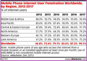
Mobile internet penetration is growing at an exponential rate. According to a recent eMarketer study, four out of five global Internet users in 2014 are mobile web users.

So, what does this growth rate mean to the online world?
Let us now look into two important actualities: having a mobile friendly site and optimizing the same.
As we talk of mobile friendly websites, a key aspect on the priority list is responsiveness. So, what is Responsive Web Design (RWD)? A responsive site is one which adapts to its surrounding environment and caters to users browsing with different device resolutions.
As Jeffrey Veen of Adobe says, “Responsive web design represents a fundamental shift in how we’ll build websites for the decade to come”.
Talking about responsive, one of the top sites we found during the recent football craze was the ‘Sequence World Cup’ campaign created by Sequence Agency, UK.

Having understood the importance of RWD, you need to look at three key considerations while making any website responsive:
The first thing that comes to mind while designing for responsiveness is whether to have a single site or multiple sites for desktop and mobile. Web designers need to decide if they need a single site and how information will flow across the web and mobile. Among these options, responsive sites occupy first place, followed by apps for mobile users which take user personas into consideration.
Other technical considerations which have been widely discussed include flexible images, grid foundation and media queries. A combination of these three makes a site responsive.
The general perception has been that responsive sites take more time to load. Ever since Ethan Marcotte introduced the concept of responsive web, designers are trying out methods to improve performance and the following are some tips on the same:
While the above two considerations improve the user experience and performance of the website, it is important for a marketer to have the site optimized for search since there is always a correlation between RWD and website experience.
Responsive web and SEO go hand-in-hand. Google support for RWD-enabled websites and search engines catering to users’ requirements for all screen resolutions makes it important to optimize websites based on RWD. Usability is one key area that Google looks at while ranking websites. RWD helps users reach the right type of content across browsers.
Content strategy combined with keyword research and analysis merits close attention. The right balance of short and long tail, and geo-specific keywords with the right density should be considered.
Having the right blend of content for mobile sites is the winning point for mobile SEO. Mobile sites mean less content and the right way to optimize less content is to have only the most necessary part of the content on your mobile site.
Site structure and internal linking should not be neglected. A deep level of interlinks going up to 2-3 clicks helps leverage SEO value. Higher level pages should be cross-linked properly.
Google has in fact recommended use of RWD and said that websites optimized for mobile will be looked at with authority by search bots. With Google giving higher importance to Usability (UX), a responsive site with the basics of SEO covered should help cater to a mobile audience as well.

In the end, it’s all about providing a quality experience – be it on a desktop or on mobile.
Go responsive & stay updated!
Contributed by Chetan Rajasekaraiah, Senior SEO Specialist, SEO team