Evolution of Mobile SEO: Is Your Website Mobile Friendly?

With 4.43 billion individuals using mobile phones world wide — 1.84 billion of them smart phones – and with half of all local searches carried out on mobile devices, it’s no wonder Google has become determined to deliver the best possible mobile user experience on search. With continuous algorithm updates the company’s message is clear: improve your mobile web development practices or suffer the consequences.

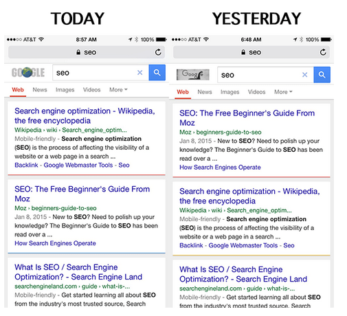
The April 21st Mobile-friendly Ranking Algorithm rollout – Mobbilegeddon — has had a significant impact on mobile search results, with websites not quite mobile friendly dropping in rankings overnight.
Moz discovered as much when their rank on mobile search for search query “SEO” dropped a notch in favor of a mobile-friendly source. Read our previous blog on Mobilegeddon to learn how it has affected search rankings on smartphones.
Your task going forward:
- learn to configure your website for mobile
- help search engines understand the website configuration
- avoid common mistakes along the way
To this end, Google has developed a mobile SEO guide to get you started. And take this test to see if your website has a mobile-friendly URL. What you are shooting for is the Google “mobile-friendly” label that appears in search results
A search result with the mobile-friendly tag looks like this:

Mobile SEO Best Practices
Mobile Site Configuration
Three ways to make a website mobile friendly:
- Responsive web design has Google’s stamp of approval. It’s the least risky course of action with the fewest opportunities for errors. Websites built using this design modality have a single URL for a piece of content. This allows users to share, like and link to the site. Getting a device optimized view requires no redirection. And that reduces page load time, saving resources for both your site and Google’s crawlers. This improvement in crawling efficiency helps Google index more of the site’s content and keep it appropriately fresh.
- Dynamic serving gets a grudging nod from Google. A server, relying on the user asking for a targeted page, reacts with distinctive HTML (and CSS) on the same URL. This server-side approach uses server-side plugins and custom user agent detection to decide how the website can be delivered to mobile devices. JavaScript detects the user’s device type when queried and adapts the code base so only the right layout is sent. It responds to desktops, smartphones and everything in between on the same URL but with different HTML and CSS.
- Separate mobile URLs – Every desktop URL has an equivalent URL serving mobile-optimized content with a separate set of HTML. And another equivalent URL serving tablet-optimized content with yet another set of HTML. These Separate mobile sites have the following configurations:
- Separate URLs for desktop, mobile, tablet, etc. (m-dot, t-dot, etc.).
- Different HTML is served for each site.
Web Design
- Design your website for the best mobile user experience. Use HTML5 for special effects rather than flash. Lose the pop ups. They irritate mobile users and result in high bounce rates. Design the website for fat fingers — seriously. Make clicking easy.
- Don’t block CSS, JavaScript and Images – The most recent guide from Google focuses on ‘exposing of JavaScript, CSS and Images’.
- Page Speed Test – Mobile searchers want results fast, so Google tests for it. Slow load times lead to higher bounce rates. Images, codes, browser caching and redirects affect page speed optimization. More information can be found on Google Page Speed insights. Bottom line: Google prefers faster websites.
- Optimize Title and Descriptions: Keep titles and descriptions as tight as possible. With less screen space, go for quality.
- Optimize for local search – Think local since one in three searches is for something nearby. For local businesses include Name, Address and Phone Number (city as well) in the site’s meta data.
Companies and designers that take the mobile friendly initiative to heart will come out on top, like the best ever search result. Those that don’t are bound to sink.

