
“Design is the method of putting form and content together. Design, just as art, has multiple definitions; there is no single definition. Design can be art. Design can be aesthetics. Design is so simple, that’s why it is so complicated.”
Paul Rand
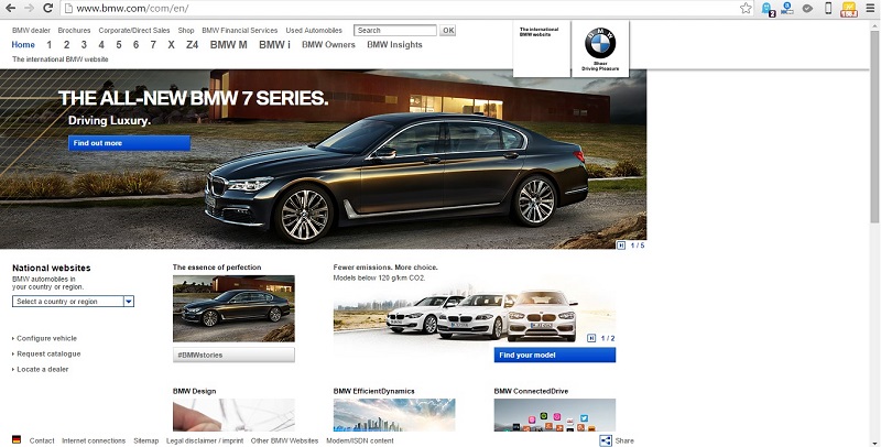
Last year’s ‘hip and cool’ website features look dowdy today. You have to stay ahead of the curve, and the curve isn’t sitting still. A well designed website – in terms of features, functionality, user experience, navigation and content — is an absolute must have.
The Big No-No’s: Page hit counters, animated gifs, flashing banners, scrolling marquees, flash intros, auto-play videos, background music, images opening in new windows, multiple font faces, styles and colors.
When the trend is minimalistic design with crisp content, you have to use whitespace correctly. If you don’t, your content will appear to be cluttered and unorganized. Whitespace strikes a balance between positive (or non-white) and negative space, which is key to aesthetic composition. Beware of inexpert use of white space. It can make a page look incomplete.
Think snackable content. Bite size is best. Break up any long text content into relevant photos and graphics, titles, bullets and paragraphs consisting of no more than 3 or 4 well-written sentences.
If your website is using more than 2 primary colors it is time for a redesign. A simple color scheme that’s pleasing to the eye is the new norm. Color increases web recognition by 80%. Sites with dark color schemes increase growth by 2%; sites with lighter color schemes experience 1.3% growth.
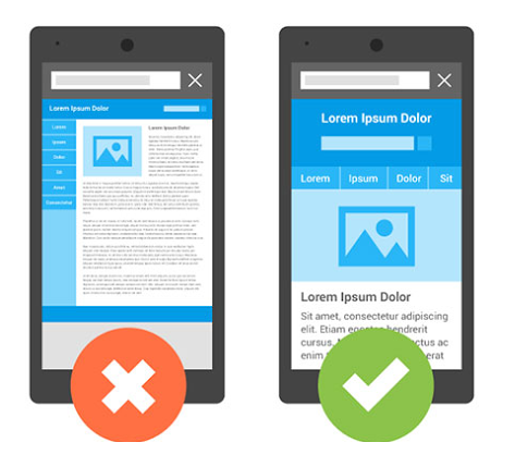
User devices range from hand-held smartphones and tablets to large widescreen PC or laptop displays. A responsive website is an essential part of a seamless user experience across all devices. Fixing your website page width at 600px, 800px, 960px , etc. will kill any user interest.
While using visuals in your marketing materials attracts and engages your viewers, unrealistic, cheesy and obviously fake stock photos will cause more harm than good. Avoid using stock images that are a clear disconnect from the values of the website and do nothing more than occupy space.

If your website isn’t designed for the future, it’s not designed for today. It may be past time to reconsider the look of your digital calling card.
Use the comment box below to share your thoughts on modern, hip and uber-cool website design trends and best practices.
